One is silent. Peaceful. Delicate. White (or off-white in this case). The way light moves across it is breathtaking. And of course, anytime you add a little texture, lace, felt, buttons, I’m in heaven. 🙂
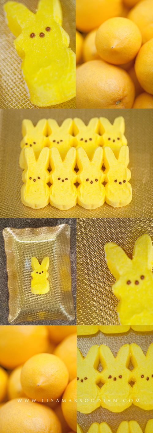
The other is bright. Bold. Playful. Maybe even yummy. Yellow. Yellow is the collaborative efforts of me and my most artistic child who is always ready for anything artistic, creative and visual.
What am I talking about, you ask? Well, this post is part of a blog carousel, a theme-based project between myself and several other talented photographers. Monochrome was the subject, and the task was to produce an image based on a single color. Without further adieu, here is my image. (okay…it’s a composite. I couldn’t pick just one.) 
Hearing of the project (and as a means of sibling intervention) I had my picture-loving child partner with me on yet another color: Yellow. I picked the lemons. He picked…sugar. I mean the Bunny Peeps . 🙂 We had such a fun morning finding all things yellow/gold…talking about monochrome and playing with macros. We styled the pictures together, shot together, and even sampled the bunnies. And in the end, we slurped up some homemade lemonade. Yum! Again, we came up with a composite to show how much fun we had!
To see more images on the Monochromatic theme, click here: Simone Hanckel Photography from Adelaide, South Austrailia
Comments
19 responses to “A Single Hue (times 2) | California Commercial Photographer”
Love these. The yellow one is a jolt of energy (especially the lemons) today while I’m feeling more than a little under the weather!
Love these!!! I would love that yellow on my wall!!
The first set is so beautiful and the yellow set is so fun – perfect!
The lace and flowers in your first image-SWOON! And I adore how you used the theme to spend time with your son and encourage his love of art. Beautiful work!
So beautiful – both for different reasons. I also love the lace and textures of the fabric. But the yellow is so happy and I love that you did that project together with your son. Love it!
What a stunning collection of images! I love the quiet elegance of the off-white but also love the cheery happiness of the yellow!
Both of them are great and so different. Loved reading that you and your son did the yellow theme together. How fun that this turned into a task for both of you!
What a great idea, to involve you kiddo! I love the vintage lace composite, simply gorgeous. And the yellow is a nice bright light into a very dreary day here in Texas!
Love how the textures pop in your ivory images, and the yellow images make me want to eat peeps!! Bright and fun!
I love it! The color is perfect and this is a perfect example of how monochrome doesn’t just have to be black and white.
I love the softness of the first set, it really showcases all the beautiful texture and detail. And the second set is just like a blast of sunshine – very welcome on a Monday morning!
Those bunnies are so cute 🙂 These are fantastic Lisa!
OH FANTASTIC!!! Love both sets, and the contrast between the softness of the first and the “pop” of the second!
So bright and happy! This made me smile for sure!
I want to print the first ones and hang them on my wall…so calm and pretty!
I enjoy the two very different interpretations on the theme. It lends itself well to the discussion of the many varying moods of color.
Ohhhh seeing your images of the lace has totally inspired me. I think I will look for some vintage lacy things and photograph them to hang in my bedroom (which is long overdo for a makeover!)
[…] the Monochrome post from a few weeks ago? Well, I had so much fun with my friends on our last blog carousel […]
Both of these are great. Did you print them as well?